The Fence of Fear

donkeyFear has played an interesting role in my life. Or better said, confronting my fears has given me the opportunity to do things I would have never done before. For example I was afraid to go to Brazil as a 16 year old exchange student for a year, but it was a life changing experience – for the better. I have been afraid to be “unknowing” and vulnerable when facilitating groups, but those have often been pivotal moments. (By the way, the picture is of me there, many many moons ago!)

But fear within groups and between members has never shown up  generatively. It seems to create tight fences between individuals in the group. Then I read Shawn Callahan (of Anecdote) recent post  about An indicator of group fear in organisations and a wee insight arrived.

First of all, click away and read the post AND take the time to view the video. Do the little exercise. It is worth the 30 seconds of cogitation.

Shawn’s conclusion is that fear is killing creativity. He writes:

Ed Catmull, the CEO and co-founder of Pixar made this point clear in his recent book, Creativity Inc., that this biggest killer of creativity is fear.

I’d say that fear blocks more than creativity. It blocks aspects of collaboration, cooperation, knowledge sharing, learning and even the simple pleasures we CAN have working with each other.

I’ve worked with a number of organizations where fear is palpable. Sometimes it is in the more day to day relationships between team members. Sometimes it is hierarchical, but not always. It isn’t always “the boss” we fear. It may be someone on the team who is bullying or harassing (consciously or unconsciously – most the latter in my observation.) Sometimes it is the very culture of the organization, often from the top, that permeates everywhere.

Slight side note: I want to make a clear distinction that I do not equate fear directly with dissent, diversity or critical thinking. They may show up together. But the absence of fear is not necessarily bland indifference, ok?  In fact, when fear is not present, I think we can better use our disagreements and diversity. So I don’t want to fall into the false trap of surface “niceness.” That kind of niceness can be a response to fear to cover it up and that doesn’t work well either! I’ll also state for the record that being “nice” as in using compassion and respect is something I’m all for. The word “nice” is a tricky one.

What really interests me are the people who seem to be resilient to fear. They don’t let fear of being dismissed, or not “liked” keep them from their own personal brand of excellence.

I find it hard to combat top down fear, so maybe I should pay more attention to those “positive deviants” who seem resilient. Have any clues on why they are that way? How we can nurture more of the resilience?



Beyond the Webinar

The earthLet me confess right up front: I really don’t like webinars. Too often they feel “done unto me.” I am powerless, at the mercy of the organizers. I may have access to a chat room (Thank Goodness!) But more often than not, these are content delivery mechanisms with token participant interaction in the form of crowded Q&A segments or polls with varying degrees of relevance. What is worse is that I have been a perpetrator of these practices so I continue to try and change my evil ways.

Changing ingrained habits requires some reflection – of self and of the state of the practice of these so-called “webinars.”  Recently I had the chance to offer feedback on a webinar I experienced as a recording.  I’ve edited/generalized my thoughts to share. In a follow up post I’ll reflect on my own practice — this is where I need to cut to the bone!
1. Us/Them: It is logical for an organizer or organizing agency to want to  appear well prepared for sharing their work. We all like folks to know we “did our homework.” We get our slides spiffed up and appropriately formatted for the webinar tool we are given. We time our remarks. We practice speaking clearly and at an appropriate pace.

The challenge this presents is that the end product puts the speaker and/or the organization at the center. We create an us/them dynamic before the event even starts. Think about set ups where the only ones who can use the voice tool to communicate are the organizers. Those who bear the presentation file are in control of the message. The tool administrator(s) control the process (i.e determining that they speak for 60 minutes, then there is Q&A.)

The use of a one way style of presentation reinforces the power dynamics of the speaker/expert/organization as central, and everyone else as “audience.” All too often, the audience is never heard. Is that a good use of precious synchronous time? Why not send out a video or narrated PowerPoint? An online gathering is time better spent as a multi-directional mode of “being together” — even online. This does NOT diminish the importance and value of content we “deliver” to others. Here are some options to consider.

Options:

  • Move away from meetings that are primarily broadcast which holds control with the presenter. Sharing information is essential, but synchronous time should always have significant multi directional interaction. For my colleagues in international development, I think everyone has values of inclusiveness and shared participation. We have to “walk this talk” in webinars as well.
  • Small things can create or break down us/them.  For example don’t just show where you are on a map at the start of a webinar, add dots for all the participants and their locations. Better yet, use a tool that allows them to add their own dots. Help the group see not only you,  but “we” – all the people working together about something we all care deeply about.
  • Because we lack body  language online, it is useful to really scrutinize our language.From the wording in the slides and by the speaker, consider changes in language so that it is more inclusive of the participants.


2. Strive for  good practices for learning/engaging online. Webinars in general run the risk of being even less engaging than a dark room face to face with a long PowerPoint. There is a saying in the online facilitation world “A bad meeting F2F is a terrible meeting online.” So we need to be even more attentive to how we structure online engagements to reflect a) how adults learn b) the high risk of losing attention (especially due to multi tasking) and c) the cultural and power diversity inherent in your group. Quality content is important, but it alone is not a reason to use an interactive platform — you can deliver content in many ways. Choosing a synchronous mode, to me,  implies interaction.

Options:

  • Consider keeping online meetings to 60 minutes. If not, do a stretch break every at 30 and 60 minutes. Say “let’s take a 60 second break.” Stand up, stretch, look away from the screen and give your body a moment of respite. We’ll call you back in 60 (90-120) seconds (sometimes a bio break is useful!)
  • A useful rule of thumb is to break up information presentation with some means of audience engagement/participation every 7-15 minutes. Use polls, chat, “red/green/yellow” feedback mechanisms, hand raising, checking for understanding, etc. This may mean you have someone facilitating these other channels if it is too distracting for the host and speakers. (Over time it does get easier, but practice is critical!)
  • Take questions approximately every 15 minutes vs holding at end. People stop listening carefully and are thus less prepared to ask questions after longer periods of time. (They are also more prone to multitasking, etc.)
  • Don’t just deliver information – use narrative. Stories hold our attention better than a series of bullet points. In fact, ditch those boring slides unless you are using the printed information to make it easier for people coming from a different first language.
  • Deliver the useful content in a different manner and use the webmeeting entirely for questions and interactions. Send a recording introducing the team. Send a narrated PowerPoint about the topic. Keep these content packages smaller. For example, if you were trying to give an overview of a portfolio of projects, you could break it up into some sub packages. 1) about the team 2) strategy, 3) project descriptions, 4) monitoring and evaluation strategy, etc.
  • Secondary tip: Do not think of these information products as polished products — don’t waste energy overproducing. That sucks the human element out of it. Imperfection is a door to engagement… seriously. Moments of uncertainty, tough questions — these engage the participants.
  • Stay relaxed as a narrator and speak at useful pace for understanding, particularly for those who have English as a second (or third, fourth) language. Keep that human touch. Add little bits of personal information and affect. Be human.
  • Let participants ask question verbally, not just in chat if possible. While there are many technical complications and sometimes the burden of accents on unclear audio channels, voice brings again brings in that human element. (Video does too, but there are bandwidth considerations. When you can, consider using it.)
  • Encourage collective note taking in the chat room or with complementary tool. When people share this task, they listen more carefully and the begin to learn about each others strengths and insights as people add additional information or annotations.
  • When someone asks a question, note who asked the question. This helps everyone see that people are heard, even if the audio option is not practical (for various reasons, no mic, etc. )  At the end of the call, specifically thank by name those who asked questions to encourage the behavior for future interactions.
  • In Q&A sections, consider a visual to help people pay attention. Use the whiteboard for noting the questions, answers, links that refer to what has been spoken about, etc.

There are a few ideas. What are yours?

Also, here are some previous posts about similar issues:

Learning from the “Rules” of Etegami: It is fine to be clumsy

From DosanKodebbie's Etegami Notebook
There is so much to learn from the THE THREE “RULES” OF ETEGAMI, a Japanese style of painting. I could write so much more, but it could not add to these three amazing rules.

1 The motto of Etegami is “It’s fine to be clumsy. It’s good to be clumsy.” What matters is whether or not you have put your heart into your painting, not whether the painting is a fine work of art. Your earnestness communicates to the person who receives the card, and touches his heart. Each etegami should express something of the character of the person who painted it.

2 Etegami is a one-shot deal; there is no underdrawing or practicing on another piece of paper before doing the actual painting. Every time you paint an etegami, you are, so to speak, “broadcasting live.” There is no concept of a “failed” or “ruined” etegami. Every etegami you paint should be placed in the mail box and sent on its way to someone else.

3 Unlike many other forms of traditional Japanese art, there is no “model” etegami painted by a master for you to imitate. The flowers and vegetables created by the hand of God are your best “models.” Observe these models closely before you begin to paint them.

via dosankodebbie’s etegami notebook: a review of the “rules” of etegami.

And because it is Monday and it has been so long since I posted a Monday video, here is Etegami in practice:

My Harvest from a Half Day at Seattle #Kaizencamp

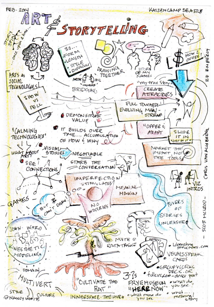
Thanks to a serendipitous conversation with friends im Benson (@ourfounder), Tonianne DeMaria Barry (@sprezzatura), I was able to pop in for 1/4 of the Seattle #KaizenCamp. If I were pitching a Hollywood script, I’d say “Open Space” meets “Lean Coffee” meets “Liberating Structures.” A group of smart, engaged people conversing about ways of working in a lovely place (The Foundry) with good food and coffee.

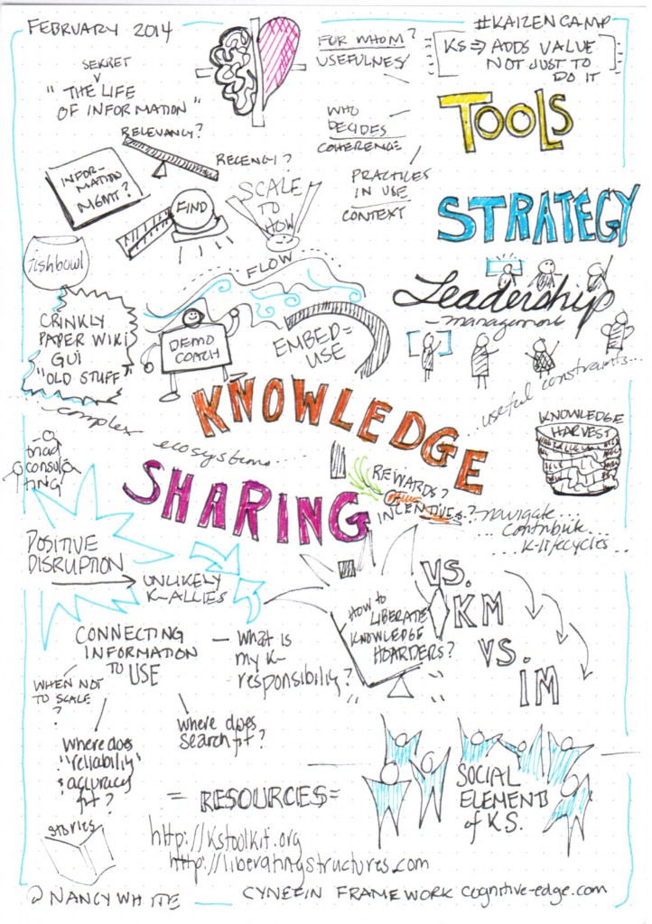
I sat at two rounds of “lean coffee,” one about Storytelling and the Arts, and one about Knowledge Sharing. I made a couple of sketch notes and captured some of the resources and I wanted to get them up and out, tagged and tweeted, before I rushed on to the next thing. (Rushing— sucks!) So here we go…

Storytelling and the Arts

KaizenCampArtStorytelling


URLs/Resources Shared:


Knowledge Sharing

KaizenCampKnowledgeSharing


URLs/Resources:


Updating My List of Facilitation Card Decks

Back in 2012 I posted about different card decks I’ve seen and used while facilitating (mostly face to face.) It turned out to be a popular post, so when I see new decks (like with then FABULOUS Groupworks Deck came out) I blog about them. Today one of the folks from the Open Innovators group  at the Hague University (where I have fun facilitating in the autumn) posted about a deck I hadn’t seen on facilitating behavior change and I thought I’d add this one to the evolving list. (Update: Here is another great list.)

The behavior change cards come from the Artefact Group. (Hey, they are in Seattle!) Here is their blurb:

artefactcardsample

This set of 23 cards was crafted to help designers, researchers, and anyone facing a behavior change challenge, think through strategies to nudge people toward positive behavioral outcomes. They work particularly well when you have in mind a specific behavior that you want to change (e.g., “We want to get more people to ride the bus,” or, “We want people to stop smoking”). We focused on making these strategies easy to grasp, incorporate, and act on.

The set is divided into five thematic sections, each featuring strategies and examples that will help you understand whythe strategies are effective, and prompt you to think through how they might be used.

  1. Make it personal: The persuasive power of “me” and “my” (cards 1– 6)
  2. Tip the scales: How perceptions of losses and gains influence our choices (cards 7– 13)
  3. Craft the journey: Why the entire experience matters (cards 14 – 17)
  4. Set up the options: Setting the stage for the desired decision (cards 18 – 21)
  5. Keep it simple: Avoiding undesirable outcomes (cards 22 – 23)

These cards should be considered a starting point, to help you think through strategies and brainstorm new ideas you may not have previously considered. Keep in mind that any given strategy, on its own, is unlikely to be a silver bullet. And while some of these strategies may work in the short term, they don’t necessarily guarantee long-term success. At the end of the day, the only way to make sure that what you’re designing has the outcome you desire is to test it with real people.

From a quick glance the cards have a product design perspective, which makes sense as the Artefact Group works in design. I scrolled through them to consider how they might work  the international development contexts I often find myself. The images feel pretty North American to me, and reflect a strong consumer culture. I could see using the cards in the US even outside of commercial product design because the examples are familiar and would offer good thinking triggers. In international development the consumer emphasis and images would not translate well.  The tips and ideas are  useful and I think they would resonate in other cultures with appropriate  reframing for different contexts. 

A little side note: As an American, I have to be particularly sensitive as people often default to a “disregard that – just another American thing” when I bring them, even if the thing I bring is NOT American. Our cultural identities and our perceptions are strong! My behavior is deeply connected to my roots, so the act of carrying ideas across boundaries is essential to my work, but it has to be done with quite a bit of care. And I still mess up!

This is one of the really tough things with any of these decks is how to make them useful across domains and cultures. Wouldn’t it be nice to be able to take a deck and remix the images? Tweak the text and create a remixed deck altogether? Someone clever could program that, I’m sure.

In the meantime, the resonance of all the decks I’ve tried is the mix of the visual with the images, the tactile experience of the cards (moving them around, sharing them in a group setting, etc.) and the triggers that both the images and the words offer us to step, at least slightly, out of our practiced thinking and behaving pathways. (Yeah, ruts!)

While you are on the Artefact Group’s site, check out their larger set of resources.  I was drawn a couple of other toolkit elements with a strong visual focus. Check out Designing for Empathy  and their relationship map (see also their whitepaper which is actually YELLOW!) . I have also downloaded “Designing to Incentivize” but haven’t read it yet. (And yes, I still dislike the word “incentivize” but I’m very interested in when incentives help and when they screw things up!) Clearly these folks have a good sense of humor. Here is a screen shot of the page with the summary of the incentives piece:incentivize